In this picture: Draft 2 (Masonite, foreground), "Final" Product (Clear Acryllic, Background)
In this picture: Draft 2 (Masonite, foreground), "Final" Product (Clear Acryllic, Background)
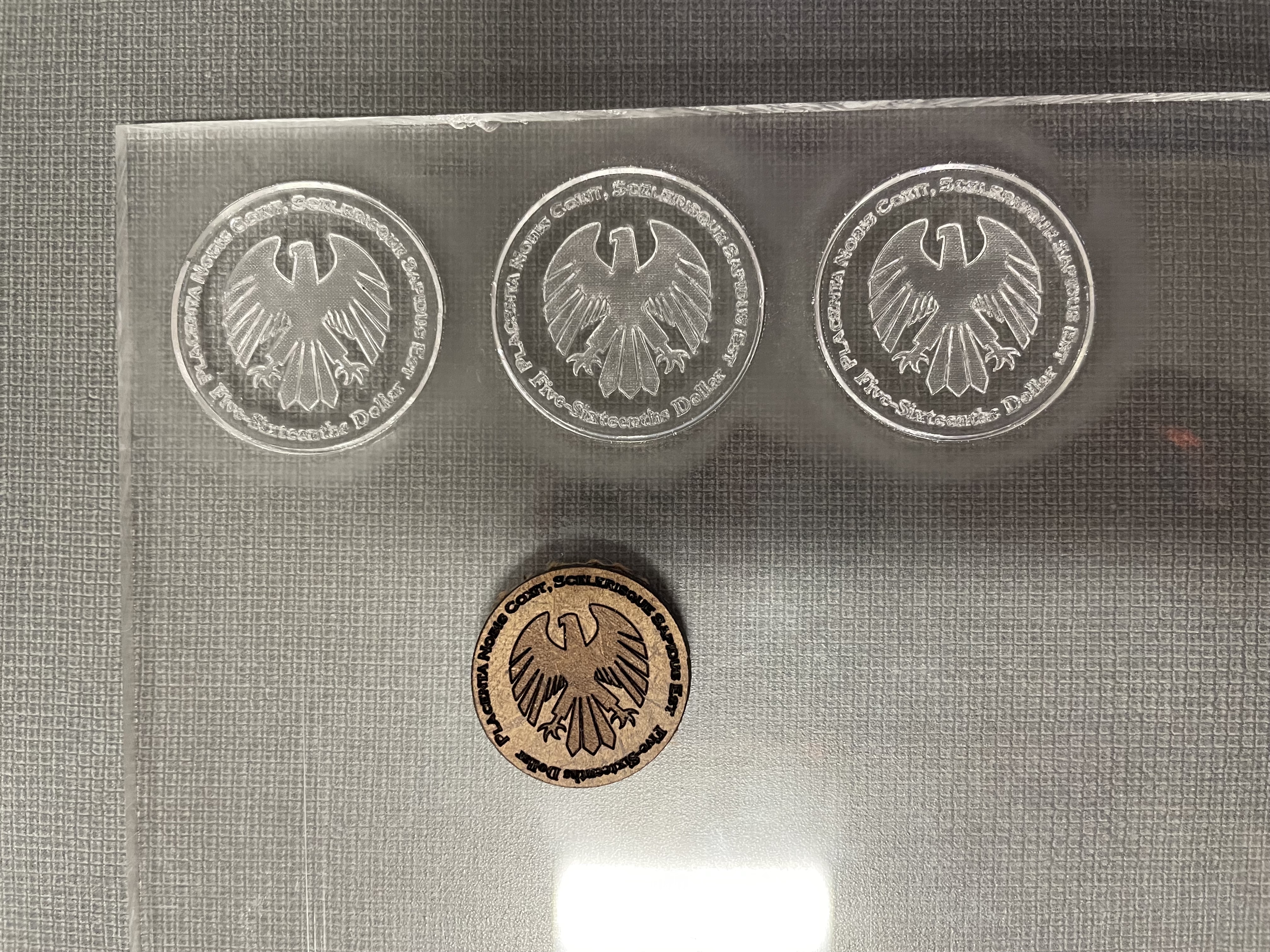
For 'The Cutting Line,' we were instructed to make a piece of art using a laser cutter and Illustrator. For me, laser cutters feel unique within the scope of fabrication because of their prescision and ability to make marks smaller and more delicately than a human hand could. For that reason, when I was brainstorming for this project, I was trying to think of ways that I could create functional art that needed small and presice cuts to work. I also had been messing around with making coasters with the BDW laser cutter prior to this project, which contributed to the idea in its own way. I eventually settled on fake coins. My first draft was a replica of a US quarter, with slightly a different font and with the George Washington sillouette completely cut out. I thought it was funny, but it was both too big (not intricate enough) and just a little blah, so I decided to keep thinking. I came up with the idea to make coins making fun of coins, and I decided to try and make that. Coming up with something funny on command has never been my strong suit, so it took a while to flesh out the ideas. I thought about the features of a coin that make it "coin like" – a latin phrase, a patriotic figure in the middle, an identifier of the value of the coin. I decided to take all of those features and make them look as if they belonged, but really be satirical under the surface. I decided on a latin phrase that looked and sounded very flowery and official, which really meant "they have made us a cake, it is chocolate flavored," and to value the coin at 5/16th of a dollar, a wildly inconvenient and unrealistic amount. As for the figure, I decided on an eagle, not because it was particularly joking, but because it fit the coin nicely and was hyper-nationalistic.
Draft 2
Creating the coin in Illustrator was fairly simple – I knew the features I wanted on it, and I knew that it had to be smaller than my original attempt. I found the size of a standard US quarter, and I decided that I would make it exactly that size in order to mimic a coin as best as I could. I put the latin phrase and the coin value in a circle on the outer edge, with the eagle in the middle. I found a spare scrap of masonite in the BDW, and because I knew this was not likely to be my final draft, I decided to use that. When I printed it, I realized that the lettering was just slightly too small to be read clearly (I guess the laser cutter is human after all! [haha joke]), and that it felt too token-like because the masonite material was thicker than a typical coin. So I went back to Illustrator!
"Final" Product
I didn't change much on Illustrator in this draft. I made the coin roughly a quarter-inch bigger than it had been, and I flipped the coin-value text so that all the text was facing the same direction. I felt that that helped differentiate between the latin "motto" and the coin-value text, and it made the coin as a whole more legible. I went back to the BDW, and this time used a piece of clear acrylic, which I wanted to use as my final material. This draft turned out much more legible (win!) but unfortunately the laser cutter didn't cut all the way through (loss.) I suspect that my piece of acrylic was thicker than I thought it had been, and the settings I inputted to the laser cutter were not strong enough. Regardless, I had to turn it in the next day (poor planning I know), so I had to let it be. If/When I recut the coins, I will be sure to set the laser cutter right so I can cut all the way through!